
Why your dashboards look great, but your leadership team doesn’t trust them
.png?width=50&name=BlueLogo%20(ClearBackgroundSpaceRemoved).png) By
Growffly
·
2 minute read
By
Growffly
·
2 minute read
Why Most Dashboards Look Good – but Fail to Drive Decisions
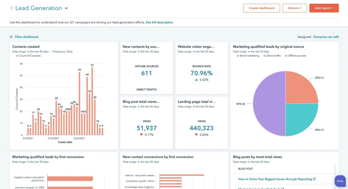
Walk into any boardroom, and the dashboards on the screen often look impressive. Polished charts, colourful visuals, and an array of KPIs can make anyone feel like the company is “data-driven”.
But here’s the uncomfortable truth: many leaders don’t actually use these dashboards when making decisions. They glance, nod politely, and then make choices based on intuition – or gut feeling.
Why?
- Bad data is the silent killer - A dashboard is only as good as the data behind it. If deals aren’t logged correctly, pipelines are incomplete, or key activities go missing, the dashboard becomes a flashy but meaningless reflection of reality. Leaders quickly learn that trusting it could lead them astray.
- Overengineered dashboards overwhelm instead of inform - It’s tempting to track everything. But when dashboards are overloaded with metrics, charts, and conflicting reports, they stop being useful. Instead of clarity, users experience confusion.
- Lack of context erodes trust - Numbers alone don’t tell the story. If leaders can’t understand the “why” behind a metric, the data is meaningless. Without context, dashboards are like reading a book in a language you don’t understand – you can see the words but can’t extract meaning.
What leaders actually want
Leaders aren’t impressed by aesthetics – they want dashboards that drive action. They want:
- Simplicity – a handful of KPIs that actually influence decisions
- Consistency – definitions that stay the same month after month
- Clarity – reports that tell a clear story behind the numbers
- Confidence – data they trust enough to make critical business decisions
A dashboard built around these principles stops being a “nice-to-have” visual – it becomes a decision-making engine.
How to fix dashboards that don’t work
Start with an audit. Trace every report back to its source. Identify where the data is incomplete or inconsistent.
Simplify dashboards. Cut KPIs that aren’t actionable or relevant. Focus on the metrics that directly impact business goals.
Align definitions across teams. Ensure everyone interprets metrics the same way. A “closed deal” should mean the same thing to sales, marketing, and leadership.
Add context. Include explanations or annotations where needed. Don’t let numbers speak alone – tell the story.
Even small adjustments in these areas can have an outsized effect on leadership trust and the decisions they make.
The takeaway
A dashboard isn’t just a visual – it’s a tool for action. When built poorly, it wastes time and erodes trust. When built well, it empowers leaders, aligns teams and drives real business growth.
The next time you sit in a meeting and glance at a dashboard, ask:
- Can I make a decision based on this data?
- Do I understand what’s really happening?
- Do I trust this enough to act?
If the answer isn't a confident "yes", it's time to rethink your dashboards